Dynamic Transcriptomics
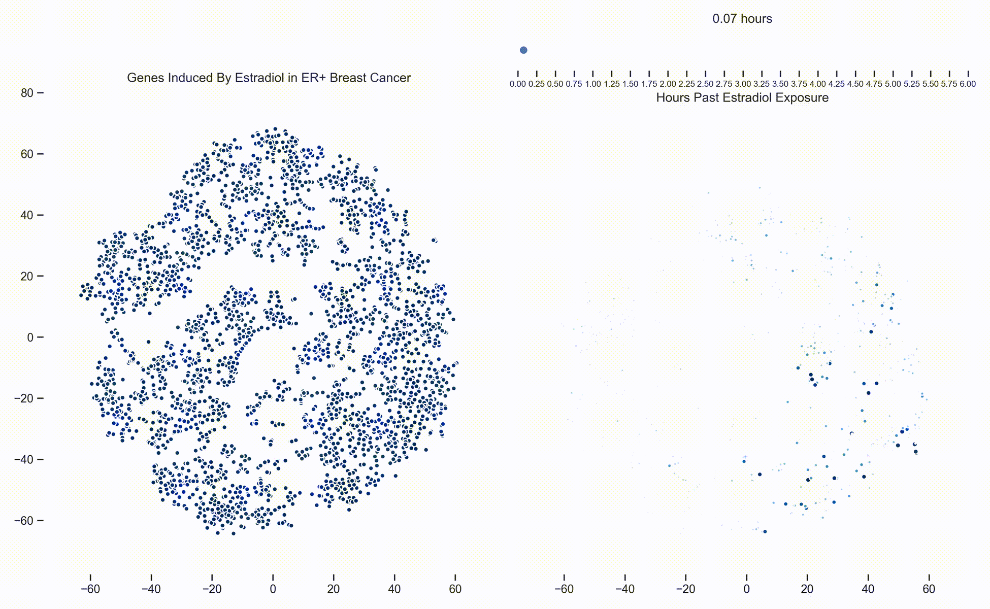 Figure 1. Left: Each dot represents one of 21,000 refseq genes. Genes are placed in 2-dimensional space via TSNE non-linear embedding of their
transcriptional dynamics across the Estradiol time series. Right: Each dot represents a gene and the size of the
dot is proportional to the relative expression of that gene at a specific time point following Estradiol exposure. This video was
constructed from 24 transcriptomic pictures and interpolated with a Gaussian Process.
Figure 1. Left: Each dot represents one of 21,000 refseq genes. Genes are placed in 2-dimensional space via TSNE non-linear embedding of their
transcriptional dynamics across the Estradiol time series. Right: Each dot represents a gene and the size of the
dot is proportional to the relative expression of that gene at a specific time point following Estradiol exposure. This video was
constructed from 24 transcriptomic pictures and interpolated with a Gaussian Process.
In a
previous post we presented a long dense transcriptomics study of gene expression following Estradiol exposure
in MCF7 cells. To our understanding, this represents the densest study of transcriptional dynamics to date.
Since then, we have been working hard on how to analyze data like these. One of the more recent developments is the use of Gaussian
Processes (GPs) to interpolate between the frames of the dynamical system. In this way, these transcriptional frames might be stitched
together into a movie where the underlying evolution of the signaling cascade can be made more readily apparent. (Figure 1)
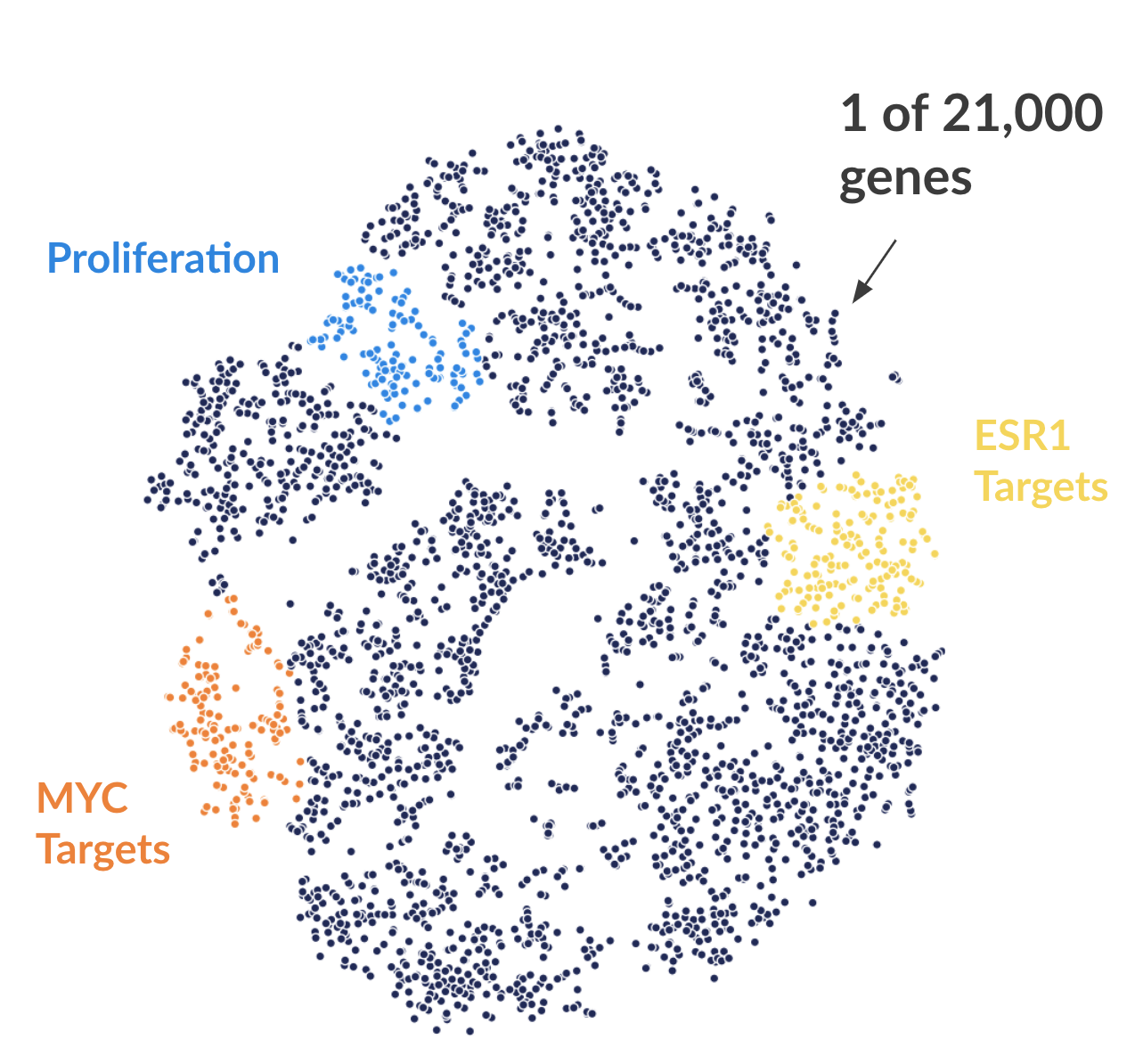 Figure 2. Each dot represents one of 21,000 refseq genes. Genes are placed in 2-dimensional space via TSNE non-linear embedding of their
transcriptional dynamics across the Estradiol time series. Dots are colored if they fall within pathways marked by the Hallmark Cancer Gene Sets
as being either MYC Targets, ESR1 Targets, or Proliferation.
Figure 2. Each dot represents one of 21,000 refseq genes. Genes are placed in 2-dimensional space via TSNE non-linear embedding of their
transcriptional dynamics across the Estradiol time series. Dots are colored if they fall within pathways marked by the Hallmark Cancer Gene Sets
as being either MYC Targets, ESR1 Targets, or Proliferation.
With the Hallmark Cancer Gene Sets (link
here at the Broad), we can annotate genes depending on whether they fall within a various pathway. Here I'm showing three such pathways (Figure 2). What is readily apparent is that genes that are grouped by transcriptional dynamics alone group into distinct clusters. Some of these clusters fall nicely with MYC targets (V1), ESR1 targets (estrogen response early genes), and proliferation signaling pathways.
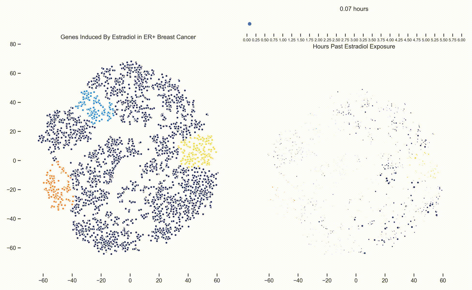 Figure 3. Left: Each dot represents one of 21,000 refseq genes. Genes are placed in 2-dimensional space via TSNE non-linear embedding of their
transcriptional dynamics across the Estradiol time series. Dots are colored if they fall within pathways marked by the Hallmark Cancer Gene Sets
as being either MYC Targets, ESR1 Targets or Proliferation. Right: Each dot represents a gene and the size of the
dot is proportional to the relative expression of that gene at a specific time point following Estradiol exposure. This video was
constructed from 24 transcriptomic pictures and interpolated with a Gaussian Process.
Figure 3. Left: Each dot represents one of 21,000 refseq genes. Genes are placed in 2-dimensional space via TSNE non-linear embedding of their
transcriptional dynamics across the Estradiol time series. Dots are colored if they fall within pathways marked by the Hallmark Cancer Gene Sets
as being either MYC Targets, ESR1 Targets or Proliferation. Right: Each dot represents a gene and the size of the
dot is proportional to the relative expression of that gene at a specific time point following Estradiol exposure. This video was
constructed from 24 transcriptomic pictures and interpolated with a Gaussian Process.
When we watch the transcriptional dynamics movie with these three pathways colored, it becomes apparent that the ESR1 genes are the first set of genes to fire, followed closely by MYC targets and then finally by signaling pathways associated with proliferation. The ordering of these events is quite important - in fact it is tempting to think that ESR1 TF activity causes downstream MYC TF activity which ultimately causes the proliferation. This idea is consistent with how we have understood estrogen signaling up to date.
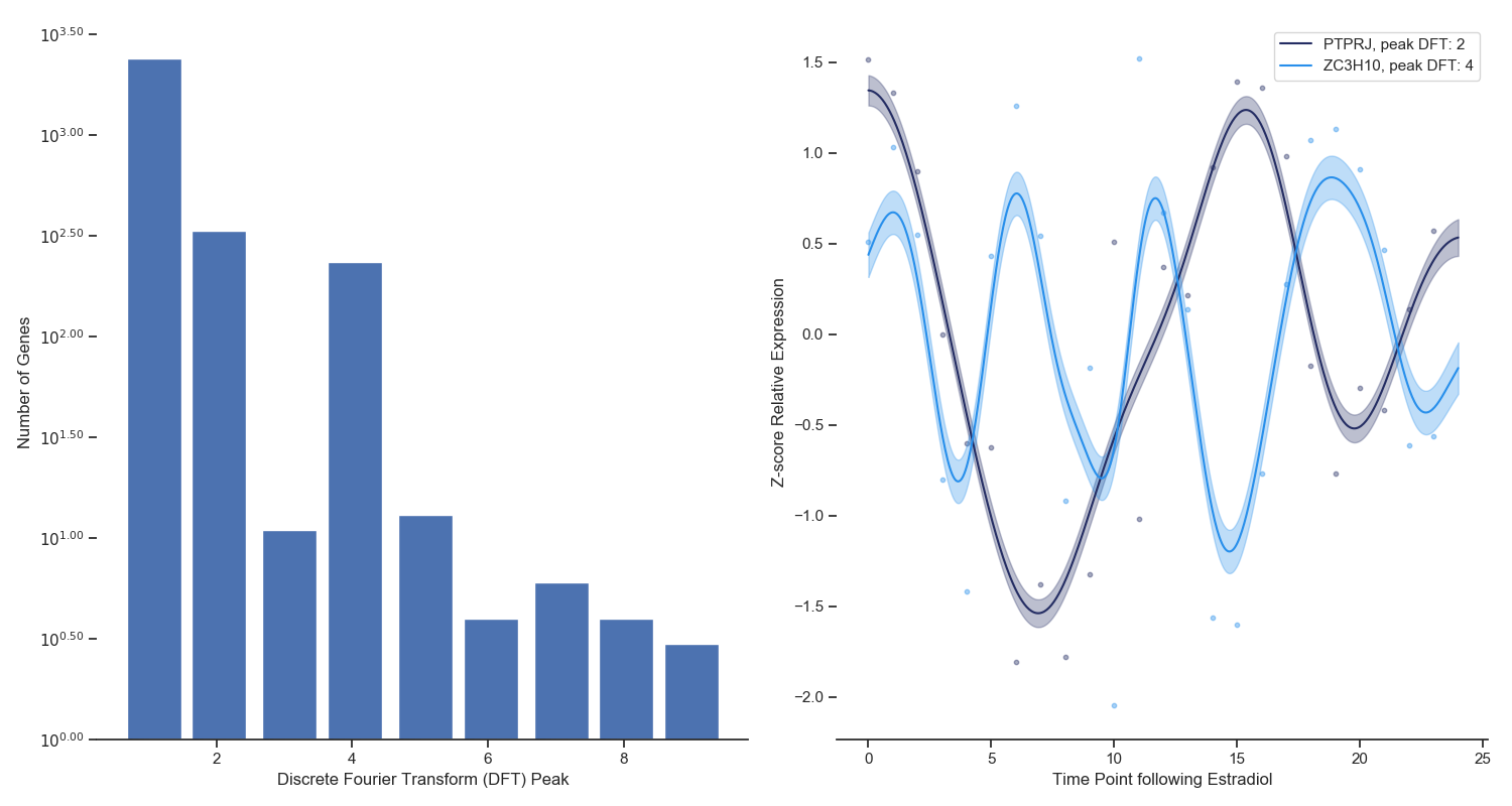 Figure 4. Left: A discrete fourier transform was ran on the top 3000 most variable genes across the Estradiol time series. The x-axis refers
to the frequency that dominates the time series data and the y-axis refers to the number of genes that have that frequency.
Right: Two examples of periodic signal with different frequencies identified via the DFT analysis.
Figure 4. Left: A discrete fourier transform was ran on the top 3000 most variable genes across the Estradiol time series. The x-axis refers
to the frequency that dominates the time series data and the y-axis refers to the number of genes that have that frequency.
Right: Two examples of periodic signal with different frequencies identified via the DFT analysis.
When you watch the transcriptional dynamics movie long enough, you can start to see clusters of genes blink on and off in periodic fashions. Until dynamical transcriptomics, we have never been able to capture periodicity like this at this scale. To isolate periodic genes (and study them), I used a simple Discrete Fourier Transform for each gene independently. The frequency with the highest weight for each gene is shown in Figure 4 (left panel) as a histogram. You can see that the vast majority of genes do not show periodicity, however there are clearly two groups of genes that do, and specifically with periods of 1.5 and 3 hours. Two genes with these periodic frequencies are shown in the right panel of Figure 4.
Future blog posts will be spent thinking about what these genes are doing and why they might have periodic dynamics. Stay tuned.
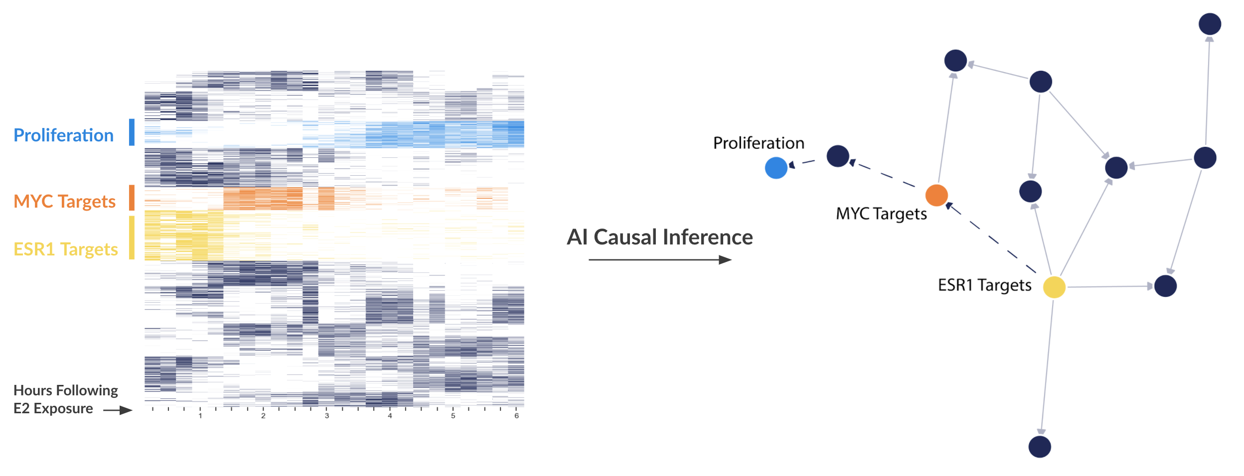 Figure 5. Left: A Heatmap showing the expression of certain genes (rows) over time (columns). The darker or more opaque the square, the higher expressed that gene is at that time. Right: A directed network representation of inferred causal interactions between clusters of genes.
As mentioned in a previous
blog post, causality can be determined from time series data through a variety of fashions. Ryan wrote on new methods related to non-linear embedding. We are now starting to develop our own causal inference methods as current off-the-shelf algorithms do not take into account the intricasies of molecular signaling pathways.
Figure 5 is a recent network that is coming off our method. Basically, the method looks at when certain clusters of genes peaks in expression to order the direction of the cluster-cluster relationship. The idea is that if cluster A causes cluster B, cluster A should peak before cluster B. We then (like non-linear embedding methods) look for delayed correlation between clusters of genes.
You can see that we are correctly ordering the ESR1 > MYC > proliferation cascade. You might also see a new cluster that hangs between MYC and proliferation. Future blog posts will be spent studying what those genes are, but it is tempting to think that these genes may be new targets for ER+ breast cancer.